
A visitor arrives at your website looking for one thing: an appointment, a donation form, a phone number, event details, or a clear answer. If they cannot read the text, use the navigation, complete a form, or understand what happens next, that opportunity can disappear quickly. Website accessibility versus usability is not a technical debate for large corporations. It is a practical business issue that affects who your organization can serve and how confidently people engage with you.
For local businesses, nonprofits, healthcare providers, museums, and community organizations, a website often acts as the front desk after hours. It should welcome more people, reduce frustration, and guide visitors toward meaningful action. Accessibility and usability support that goal in different ways, but neither should be treated as optional.
What Website Accessibility Means
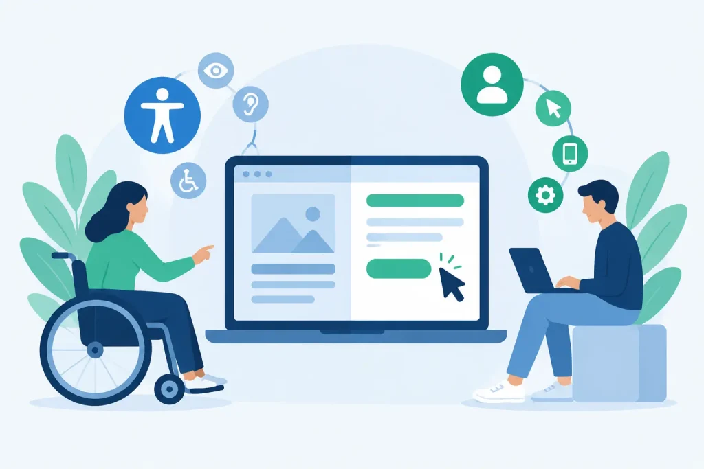
Website accessibility means designing and building a website so people with disabilities can perceive, understand, navigate, and use it. This includes people who are blind or have low vision, are Deaf or hard of hearing, have limited mobility, experience cognitive differences, or use assistive technology such as screen readers, keyboard navigation, voice controls, or screen magnification.
Accessibility is often associated with technical requirements, and there is truth in that. A website needs a sound foundation: meaningful page structure, descriptive image alternatives, readable color contrast, captions for video, labels for form fields, and controls that work without a mouse. These details help assistive technology communicate what is on the page and how a visitor can interact with it.
Consider a registration form for a community class. A sighted visitor may recognize that a red outline means a required field was missed. But a visitor using a screen reader needs the error explained in words and connected to the correct field. A visitor who uses only a keyboard needs to move through the form in a predictable order and see where their focus is. Accessibility ensures those visitors are not left to guess.
Accessibility also has a business and risk-management dimension. Depending on your industry, audience, funding, or public role, accessibility obligations may be more direct. Healthcare entities, public-facing institutions, and organizations that serve broad community audiences should be especially thoughtful. Still, the strongest reason to improve accessibility is simpler: people should be able to use the services and information you make available online.
What Website Usability Means
Usability is about how easy and effective a website is for its intended audience. It asks whether people can quickly understand what you offer, find the information they need, and complete a task without unnecessary effort.
A usable website has clear navigation, logical page hierarchy, plain-language content, recognizable buttons, fast-loading pages, and forms that do not ask for more information than necessary. It also works well on mobile devices, where many local customers first encounter a business or organization.
For example, a coastal lodging business might have an accessible booking button with proper keyboard support and a clear label. That is essential. But if the button is buried under several competing calls to action, uses vague wording such as “Learn More,” or opens a confusing multi-step process, the experience is still difficult. The site may meet an accessibility requirement in that moment while falling short on usability.
Usability is closely tied to trust. Visitors are more likely to call, schedule, donate, buy, or visit when a website feels organized and straightforward. Confusing navigation and cluttered pages create doubt, particularly for people who are comparing options quickly or trying to access urgent information.
Website Accessibility Versus Usability: The Key Difference
The clearest difference is scope. Accessibility asks, “Can people with different abilities use this website?” Usability asks, “Can people accomplish what they came here to do easily?”
Accessibility focuses on removing barriers to access. Usability focuses on reducing friction for everyone. The two overlap often, but they are not interchangeable.
A site can be usable for many visitors but inaccessible to others. A visually polished menu may be easy to understand for mouse users yet impossible to operate with a keyboard. A video may communicate an important message clearly but exclude people who cannot hear it if captions are absent.
The reverse can happen as well. A site may include many of the required accessibility features but still be frustrating to use because its content is dense, its menu is overcrowded, or its primary actions are unclear. Technical conformance alone does not guarantee a positive customer experience.
The best websites treat accessibility and usability as connected disciplines. Accessibility expands who can participate. Usability makes participation easier, faster, and more productive.
Where Accessibility and Usability Work Together
Many improvements create value on both sides. Clear headings help screen-reader users understand a page structure, and they help all visitors scan a page quickly. High color contrast supports people with low vision and makes text easier to read outdoors on a phone. Captions assist people who are Deaf or hard of hearing, while also helping a visitor watch a video in a quiet waiting room or noisy public space.
Plain language is another strong example. It can help people with cognitive disabilities, visitors who are unfamiliar with industry terminology, and busy customers who simply want a direct answer. A healthcare practice does not need to remove necessary medical detail, but it should explain next steps in language patients and families can understand.
Forms deserve particular attention because they are where interest becomes action. Whether a visitor is requesting IT support, signing up for a newsletter, applying for a program, or making a donation, each field should have a clear purpose. Instructions should appear before a mistake occurs, errors should be specific, and confirmation should tell the person what to expect next.
Common Gaps on Small Organization Websites
Smaller organizations do not usually set out to create barriers. Problems often develop over time as pages, plugins, images, event tools, and third-party forms are added by different people. A website can look current while carrying hidden issues that limit access or make routine tasks harder than they need to be.
Common gaps include images with missing or generic alternative text, text placed over busy backgrounds, low-contrast buttons, PDFs that cannot be read properly by assistive technology, auto-playing media, and contact forms without usable labels. On the usability side, organizations often struggle with too many menu choices, outdated service pages, unclear location or contact information, and mobile layouts that force visitors to pinch, zoom, or hunt for the right button.
Third-party tools require scrutiny as well. A scheduling platform, donation system, online store, map, or event calendar may be convenient, but it becomes part of your customer experience the moment it appears on your site. If that tool is difficult to navigate or inaccessible, your visitors will not distinguish between the vendor and your organization.
A Practical Way to Improve Both
Start with the highest-value visitor tasks. For a service business, that may be calling, requesting a quote, booking an appointment, or finding service areas. For a nonprofit, it may be donating, registering for an event, accessing a program application, or locating resources. For a museum or local attraction, it may be checking hours, purchasing tickets, or reviewing accessibility information before a visit.
Then test those tasks realistically. Use a phone, a desktop browser, and keyboard-only navigation. Ask whether every interactive element is reachable, whether the focus indicator is visible, and whether a visitor can tell what each button will do. Read key pages aloud. If the language sounds vague, overloaded, or overly technical, revise it.
A meaningful review should combine automated scanning with human testing. Automated tools can flag issues such as missing page titles, empty links, or contrast concerns. They cannot reliably determine whether a page is understandable, whether alternative text is useful, or whether a checkout flow makes sense. Human review provides the context that software cannot.
Prioritize fixes based on impact. A missing caption on a decorative video may matter less than an inaccessible appointment form. A broad redesign may be appropriate for an outdated site, but many organizations can make immediate progress by correcting navigation, forms, contrast, headings, and content clarity first. The right approach depends on your existing platform, budget, audience needs, and the systems connected to the site.
Build Accessibility Into Ongoing Website Management
Accessibility and usability are not one-time projects. New pages, images, staff updates, event postings, and software changes can introduce fresh problems. Establishing simple publishing standards keeps quality from slipping after a redesign.
Staff members who update content should know how to write meaningful image descriptions, use heading styles instead of bold text as a substitute for structure, avoid color-only instructions, and check links and forms before publishing. Leaders should also treat website feedback as useful operational information. A visitor who cannot find a phone number or complete a request is showing you where a process needs attention.
Epuerto helps organizations connect web design, managed technology, security, and local marketing into comprehensive digital solutions. That integrated perspective matters because a website should not only look professional. It should support the real work of serving customers, patients, members, donors, and neighbors.
A better website begins with a simple question: can every person who needs us take the next step? Keep asking it as your organization grows, and your digital presence will become more useful, more welcoming, and better prepared to produce real, measurable outcomes.