
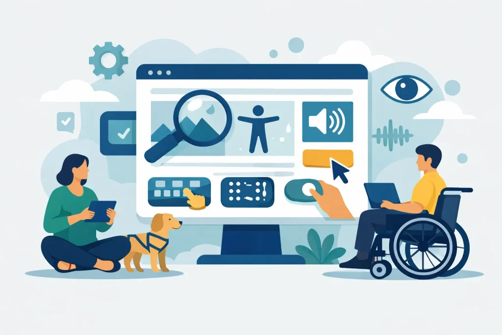
A donor is ready to give, a parent is trying to register for a program, or a community member needs services by the end of the day. If your site is hard to read, impossible to navigate by keyboard, or confusing on mobile, that person may never get what they need. Nonprofit website accessibility is not a side project. It directly affects participation, trust, and the reach of your mission.
For nonprofits, accessibility has a practical impact long before anyone talks about compliance. It affects whether people can complete forms, understand your message, find event details, or ask for help without frustration. When budgets are tight and teams are small, every missed interaction matters. A more accessible website improves service delivery, supports fundraising, and helps your organization show up as inclusive in a way people can actually experience.
Why nonprofit website accessibility matters beyond compliance
Many organizations first hear about accessibility through legal risk. That concern is real, but it is only one part of the picture. A nonprofit website often serves people with varied abilities, devices, internet speeds, and levels of digital comfort. If the site assumes everyone uses a mouse, sees small text clearly, hears audio content, or has the patience to decode cluttered pages, it creates barriers that work against the mission.
Accessibility also supports broader communication goals. Clear headings help screen reader users, but they also help busy donors scan a campaign page. Good color contrast helps users with low vision, but it also helps someone reading on a phone outside in bright sunlight. Captions support people who are deaf or hard of hearing, and they also help viewers watching a video with the sound off. The overlap is substantial. Better accessibility usually means a better experience for everyone.
That said, accessibility is not a one-button fix. It depends on the age of your website, the platform you use, the quality of your content, and how often your team updates pages, PDFs, forms, and media. Some improvements are quick wins. Others require design changes, code updates, content cleanup, or a more reliable web process going forward.
The most common barriers on nonprofit websites
Most nonprofit sites do not fail because of one dramatic flaw. They struggle because of many smaller issues that stack up. Navigation may look fine visually but break down for keyboard users. Buttons may say “click here” instead of telling people what they actually do. Donation forms may be difficult to complete with assistive technology. Event flyers may be uploaded as image-only PDFs that screen readers cannot interpret.
Content is often where accessibility problems multiply. Staff members are busy, volunteers help with updates, and many organizations use several tools at once for forms, calendars, donation systems, newsletters, and embedded media. Each tool can introduce a new barrier. A polished homepage does not help much if your program application, online payment page, or event registration flow is unusable.
Images are another common problem. Alt text is either missing, stuffed with keywords, or written so vaguely that it adds no value. Good alt text should communicate the purpose of the image in context. If a photo supports a story about a youth arts program, the description should reflect that purpose rather than mechanically naming every object in the frame.
What good nonprofit website accessibility looks like
Accessible websites are not plain or stripped down. They are organized, readable, and dependable. A visitor should be able to move through the site with a keyboard, understand where they are, and complete important actions without guesswork. Headings should follow a logical order. Forms should have clear labels and helpful error messages. Links should make sense on their own, without forcing users to read surrounding text for context.
Visual design still matters. In fact, accessibility and strong design work well together when handled properly. Clear contrast, readable typography, consistent layouts, and thoughtful spacing make a site feel more professional and trustworthy. For nonprofits, that matters because credibility influences donations, volunteer signups, program applications, and partnerships.
Accessibility also includes mobile use. Many community members first visit a nonprofit site on a phone, sometimes on older devices or slower connections. If menus are hard to open, text is too small, or forms require excessive pinching and zooming, your website is creating friction where you can least afford it.
Where to start if your team is short on time
If your nonprofit has limited staff or budget, start with the pages that carry the highest value. That usually means your homepage, donation pages, contact page, service or program pages, event registration, and any form people need in order to take action. These pages drive the outcomes your organization depends on.
Begin with an accessibility review that looks at both the front-end experience and the systems behind it. Automated scans can help identify obvious issues, but they do not tell the full story. They may flag contrast errors or missing alt text, yet miss confusing navigation, poor form behavior, or content that is technically compliant but still hard to use. Human review matters, especially for organizations serving broad community audiences.
Once the main issues are identified, prioritize fixes by impact. A decorative issue on a secondary page can wait. A donation form that cannot be completed by keyboard users should not. The same goes for inaccessible service intake forms, application pages, and basic contact pathways. Accessibility work is most effective when it is tied to real user journeys rather than treated as a disconnected checklist.
Nonprofit website accessibility is also an operations issue
This is where many organizations get stuck. They improve a few pages, then accessibility starts slipping again because the publishing process never changed. A new staff member uploads a scanned PDF. A volunteer adds low-contrast text to a flyer. A third-party plugin update creates navigation problems. Without a clear workflow, accessibility gains are temporary.
That is why nonprofit website accessibility should be treated as part of ongoing digital operations, not just a redesign task. Your website, forms, email systems, media assets, and hosting environment all work together. If one part breaks the user experience, the mission impact is real.
A stronger approach is to set practical standards your team can follow. Use heading styles properly. Require alt text where needed. Keep button language specific. Test forms before publishing. Review PDFs before uploading them. Choose web tools that support accessibility instead of fighting it. For organizations managing both IT needs and public-facing communication, this kind of coordination produces real, measurable outcomes.
The role of platform, maintenance, and vendor support
Some accessibility issues are content problems. Others are structural. If your site is built on an outdated theme, overloaded with plugins, or tied to tools that were never configured correctly, staff training alone will not solve it. At that point, the question becomes whether to patch what you have or invest in a more stable platform.
There is no universal answer. If the site is fundamentally sound, targeted updates may be enough. If it is aging, insecure, difficult to edit, and underperforming in search and usability, a broader rebuild may offer better value. Nonprofits often need to balance immediate fixes with long-term sustainability, especially when one website must support donations, events, community information, and daily administrative tasks.
This is also why vendor consolidation can help. When the same partner understands your hosting, security, website structure, forms, and content workflows, accessibility improvements are easier to maintain. Problems get solved in context instead of being passed between disconnected providers. For regional nonprofits and community institutions, that kind of integrated support can reduce risk and save time.
Accessibility strengthens trust in your mission
People notice when a website feels easy to use. They may not describe it as accessibility, but they feel the difference. They can find what they need, complete the task, and move on with confidence. For a nonprofit, that confidence is valuable. It supports donations, volunteer engagement, program participation, and public trust.
Accessible websites also send a message about how an organization operates. They show care, competence, and follow-through. That matters when your audience includes seniors, families, caregivers, board members, grant funders, and community partners. If your mission is centered on service, advocacy, education, or inclusion, the website should reflect that standard in practice.
For many organizations, the best next step is not chasing perfection. It is committing to steady improvement, starting with the pages and systems that matter most. When accessibility becomes part of how your nonprofit manages technology and communication, your website does more than meet a standard. It becomes a stronger tool for serving people well.