A website that looks polished but blocks people from using it is not finished. For businesses, nonprofits, healthcare organizations, and community institutions, that gap creates more than frustration. It can affect customer trust, search visibility, conversions, and legal exposure. A practical website accessibility compliance checklist helps you catch those issues before they become expensive problems.
Accessibility is often treated like a last-minute plugin or a legal checkbox. In reality, it is part of building a site that works for real people in real situations. That includes a customer using a screen reader, a senior visitor increasing text size, a parent browsing on a phone in bright sunlight, or a staff member trying to complete a form without a mouse. When your site is easier to use, your organization becomes easier to trust.
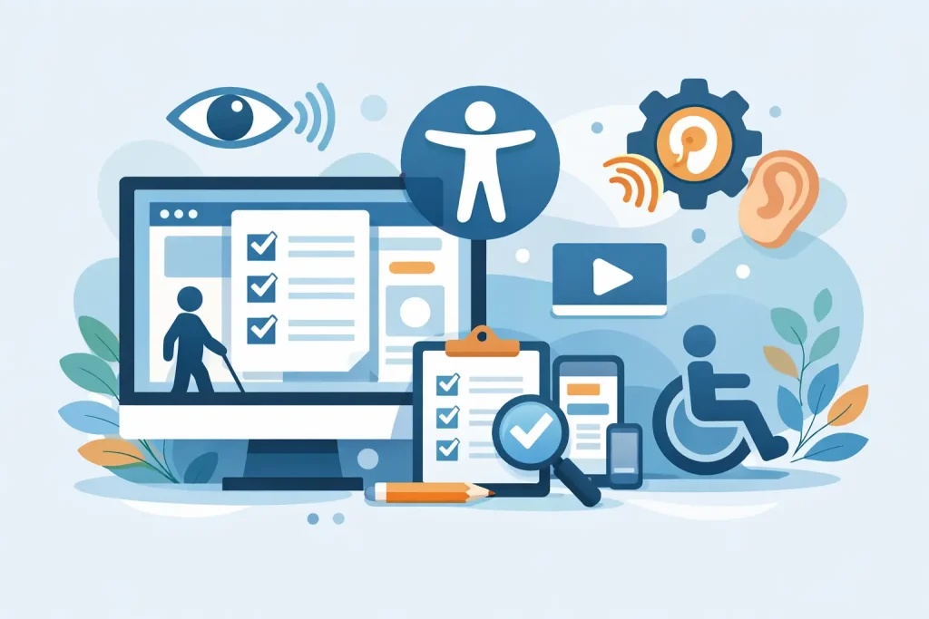
What a website accessibility compliance checklist should cover
The strongest checklist does not focus on one single widget or visual fix. It should cover structure, content, design, media, navigation, forms, and ongoing maintenance. Compliance is usually measured against WCAG standards, but most organizations do not need to memorize technical success criteria to make progress. They need a reliable framework for reviewing their website and prioritizing the right fixes.
That means asking practical questions. Can visitors understand the page structure? Can they move through the site with a keyboard? Are videos usable without sound? Do forms tell users what went wrong? Is the color contrast strong enough for low-vision users? If the answer is no, the site is creating unnecessary barriers.
Start with the structure behind the page
A clean visual design does not guarantee accessibility. Screen readers and keyboard users rely on the page structure underneath the design, which is why headings, labels, landmarks, and page titles matter.
Each page should have one clear main heading that matches the page purpose. Subheadings should follow a logical order instead of skipping levels just to match a design preference. Page titles should be specific enough that a user can tell the difference between service pages, product pages, blog posts, and contact pages without guessing.
Navigation also needs to be predictable. Menus should stay consistent from page to page, and users should be able to skip repetitive elements when needed. If your site uses pop-ups, sliders, or off-canvas menus, those features need extra attention. They often create accessibility issues even when they look modern.
Check whether the site works without a mouse
This is one of the fastest tests you can run, and it reveals more than many business owners expect. Open your website and try to use it with only the Tab, Enter, Space, and arrow keys. If you get stuck, lose track of focus, or cannot activate important controls, users with mobility limitations may be blocked as well.
A visible focus indicator is essential. Visitors should always be able to see where they are on the page. Buttons, links, dropdowns, modal windows, and form fields should all respond clearly to keyboard input. If a booking form, donation page, or checkout process fails this test, the problem goes beyond compliance. It affects revenue and engagement directly.
Review text, contrast, and readability
Many accessibility problems begin with design choices that look refined in a mockup but become hard to use in practice. Light gray text on a white background, tiny fonts, and long blocks of centered copy may fit a brand aesthetic, but they reduce readability quickly.
Good accessibility supports strong communication. Body text should be large enough to read comfortably, line spacing should not feel cramped, and contrast between text and background should be high enough for users with low vision or poor lighting conditions. Links should be clearly identifiable without relying only on color. If a user cannot tell what is clickable, your site is making them work too hard.
Plain language matters too. Accessibility is not only about code. If instructions are vague, service descriptions are confusing, or menu labels are inconsistent, visitors will struggle even if the underlying site is technically sound.
Make images and media usable
Every image does not need a long description, but meaningful images need alt text that communicates purpose. If an image is decorative, it should be treated that way so assistive technologies can ignore it. If it contains important information, that information needs to be available in text.
Videos should include captions. For many organizations, this is one of the highest-impact fixes because video is now common across homepages, campaigns, training content, and social embeds. Captions help users who are deaf or hard of hearing, but they also help people watching on mute, in public spaces, or in noisy environments.
Audio-only content should include transcripts when possible. If your site uses autoplay media, animated banners, or flashing effects, be careful. These can create real access issues and hurt the user experience for everyone.
Forms are where accessibility problems become business problems
A lot of websites look acceptable until a visitor tries to fill out a contact form, registration form, intake form, or payment page. This is where abandoned actions happen.
Every field should have a real label, not just placeholder text inside the box. Instructions should be clear before users start typing, and errors should explain what needs to be fixed in plain language. If a field is required, that should be identified clearly. If the form times out too quickly or depends on a complicated CAPTCHA, some users may not be able to complete it.
For healthcare organizations, nonprofits, and local service businesses, accessible forms are especially important because they often handle appointments, applications, donations, and service requests. A broken form is not just a design flaw. It is lost opportunity.
Use accessibility tools, but do not stop there
Automated scanners can help identify missing alt text, low contrast, empty links, and heading problems. They are useful for finding patterns fast, especially on larger sites. But no scan can fully tell you whether a site is understandable and usable.
That is where manual review matters. Someone should test the site with a keyboard, review page templates, examine content structure, and evaluate the experience on desktop and mobile. If your organization manages multiple departments, contributors, or content editors, this becomes an ongoing process rather than a one-time cleanup.
This is also where working with a partner who understands both technical infrastructure and public-facing digital performance can make a difference. Accessibility touches hosting, development, design, content, and compliance risk all at once. Treating it as a silo usually leads to patchwork fixes.
Common trouble spots on small business and community websites
For small to mid-sized organizations, the same issues appear again and again. Older websites often use page builders that generate messy heading structures or unlabeled buttons. Redesigns may improve appearance while introducing low-contrast text and motion-heavy elements. PDF documents, event calendars, map embeds, third-party booking tools, and online donation systems can all create accessibility gaps.
The hard part is that some of these features are outside your direct control. It depends on the vendor, the platform, and how much customization is available. That is why a website accessibility compliance checklist should include third-party tools, not just your own page content. If a key function on your site depends on an inaccessible external service, the user still experiences your brand as inaccessible.
Accessibility is not separate from growth
Organizations sometimes frame accessibility as a legal obligation and nothing more. That view is too narrow. Accessible websites tend to be better organized, easier to navigate, and clearer in their messaging. They support SEO because content structure improves. They support conversions because users can complete tasks more easily. They support brand credibility because visitors feel considered rather than excluded.
For community-based organizations in particular, accessibility aligns with the mission. If your goal is to serve local customers, residents, patients, members, or visitors, your digital presence should not create avoidable barriers. A website should extend access, not limit it.
How to use this checklist in a practical way
Do not wait for a full redesign to start. Review your highest-traffic pages first, then move to the pages that drive the most important actions such as contact, appointments, donations, purchases, and applications. Fix structural and navigation issues before polishing minor visual details. Document what you find so accessibility becomes part of normal site maintenance.
If your website is tied to broader systems like hosting, cybersecurity, content updates, and marketing execution, it helps to approach accessibility as part of your larger digital strategy. That is often where organizations see real, measurable outcomes because the fixes improve both compliance posture and user performance. For businesses and institutions that need one accountable partner across web, IT, and digital communications, Epuerto sees accessibility as part of a stronger, more dependable online presence.
The right checklist does more than help you pass a review. It helps you build a website that welcomes more people, supports your goals, and reflects the quality of the organization behind it.