![The best [search_term] in [location], Oregon](https://epuerto.com/wp-content/uploads/2023/10/epuerto-logo-blanco-celeste-02.svg)
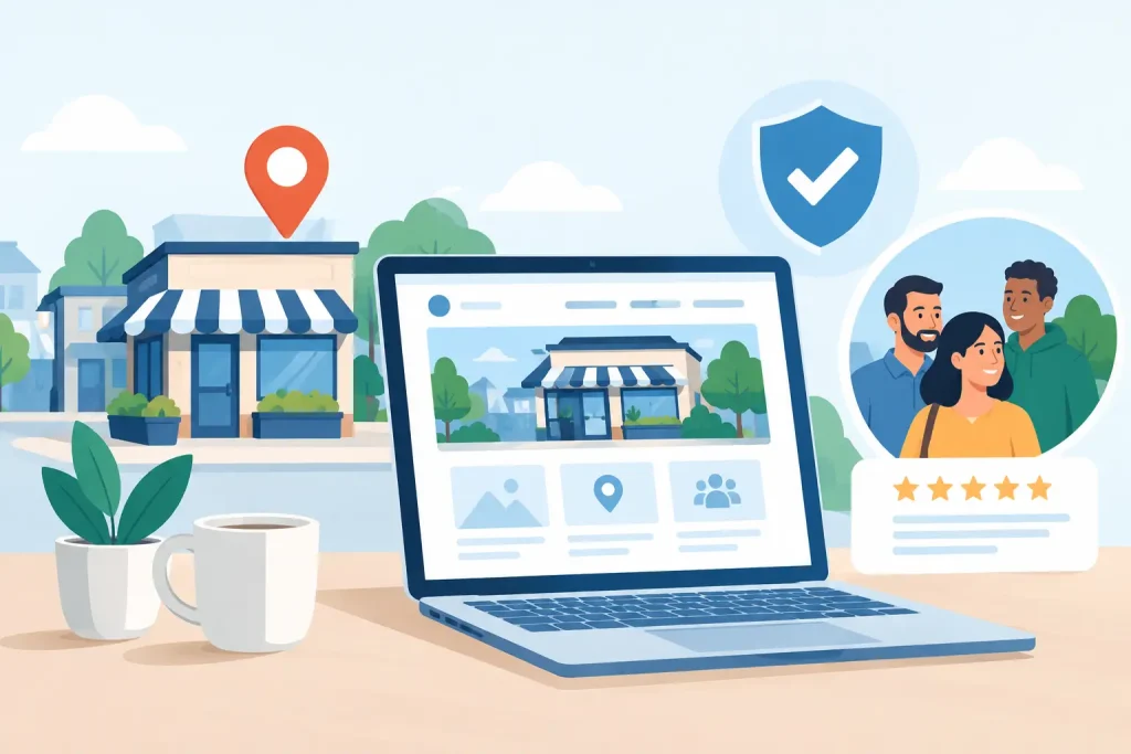
A website is often the first place a potential customer decides whether a local business feels credible, current, and easy to work with. The most valuable web design trends are not about chasing visual novelty. They are about reducing friction, proving trust, and helping people take the next step – whether that means calling a clinic, donating to a nonprofit, booking a service, or visiting a storefront.
For small and mid-sized organizations, that distinction matters. A dramatic redesign that loads slowly or hides essential information can cost more than it delivers. A well-planned site, on the other hand, can strengthen visibility across search, social media, digital displays, email, and every other channel that brings people to your organization.
Web Design Trends for 2026 Start With Clarity
The strongest trend is a move away from websites that make visitors work for answers. People arrive with practical questions: What do you do? Who do you serve? Where are you located? How do they contact you? What will happen next?
Modern websites answer those questions quickly. Homepages are becoming more focused, with clear headlines, meaningful service descriptions, visible calls to action, and navigation that reflects how customers actually make decisions. This is especially effective for community organizations with several audiences, such as members, donors, visitors, patients, volunteers, or business clients.
Clarity does not mean every page must look plain. It means visual design supports the message instead of competing with it. A coastal museum may use compelling exhibit imagery. A managed IT provider may use concise diagrams to explain security or backup services. The creative direction should reinforce the organization’s purpose, not distract from it.
Faster Websites Are Becoming a Trust Signal
Speed has been a technical priority for years, but visitors now experience it as a brand signal. A slow page suggests an organization may be difficult to reach, behind on technology, or less prepared than its competitors. That is not always fair, but it is a real part of online decision-making.
The trend is toward lighter pages built with intention. Large image files, autoplay videos, excessive animations, and too many third-party scripts can make a site feel polished in a design review but frustrating on a phone with limited service. For regional businesses serving visitors, travelers, and rural communities, mobile performance is particularly important.
A fast website also supports better outcomes beyond the page itself. It can improve the experience for search visitors, increase inquiry completion, and make paid advertising more efficient because more people stay long enough to engage. The trade-off is that high-impact media still has a place. A video tour, visual portfolio, or virtual exhibit may be worth the added weight when it has a clear job to do. The key is optimization, not stripping every page down to bare text.
Design for the mobile moment
Mobile-first design is no longer simply about making a desktop layout shrink. It means planning for a person standing in a parking lot, waiting in an office, scrolling during a lunch break, or looking for a phone number after business hours.
Buttons need enough space to tap. Forms need to ask only for information your team will use. Addresses, directions, hours, and contact options should be easy to find. If customers regularly call, a prominent tap-to-call option can be more useful than an elaborate contact page. If appointments drive revenue, the booking path should be visible before visitors have to scroll through a long introduction.
Accessibility Is Better Design, Not a Checkbox
Accessibility is one of the most meaningful web design trends because it serves real people while improving the experience for everyone. Clear contrast, readable type, logical heading structure, descriptive image text, keyboard navigation, and captions for video help visitors with disabilities use your site more effectively.
They also help a wider audience. High contrast is easier to read outdoors. Captions help someone viewing a video without sound. Plain language helps customers who are unfamiliar with industry terms. A well-structured page is easier to scan on a small screen.
For healthcare entities, public organizations, nonprofits, and businesses that serve broad local audiences, accessibility should be part of the initial design process. Retrofitting it later can be more expensive and less effective. It also requires ongoing attention when staff members add event flyers, PDFs, videos, and new website content.
Authentic Visuals Are Replacing Generic Stock Imagery
Stock photography still has a role, especially when a business needs a professional image for a topic that cannot be photographed easily. But many organizations are moving toward authentic visual content because it creates immediate local recognition.
Photos of your team, facility, products, projects, community events, and customers can make a website more believable. A visitor who sees a familiar street, a recognizable venue, or the people who will actually provide service gains context that generic visuals cannot provide.
This does not require a large production budget for every page. A thoughtful photo session can create a library of images for web pages, social posts, digital displays, print materials, and email campaigns. That consistency helps a community recognize your organization wherever it appears.
The caution is quality. Poorly lit phone photos, outdated staff images, or a random mix of styles can weaken a brand. Authentic does not mean unplanned. It means choosing imagery that reflects the real standard of your organization.
AI Can Improve Content Operations, With Human Direction
Artificial intelligence is influencing web design through faster content drafting, image assistance, code support, chat features, and personalization tools. For busy teams, these capabilities can reduce the time required to update routine pages or organize a first draft of content.
But AI-generated material should not become a substitute for local knowledge and professional review. A website needs accurate service details, correct policies, real staff expertise, and a voice that sounds like the organization visitors will encounter in person. Generic language may fill space, but it rarely builds confidence.
The practical use of AI is as an assistant to a clear strategy. It can help your team identify content gaps, develop initial page outlines, or create variations for testing. A knowledgeable person should still review accuracy, accessibility, brand alignment, and customer relevance before publishing.
Build Pages Around Proof, Not Promises
Visitors have become more skeptical of broad claims such as “best service” or “trusted experts” when there is little evidence behind them. Strong websites now put proof closer to the decision point.
That proof may include concise testimonials, project examples, certifications, partner affiliations, staff credentials, service areas, transparent process details, or current community involvement. A nonprofit can show the outcomes of a program. A contractor can show completed work. A healthcare organization can make provider information and patient resources easier to find.
The right evidence depends on the organization. Too many badges, popups, and testimonials can make a page feel crowded. A better approach is to identify the hesitation that prevents action, then provide the most relevant reassurance. If visitors worry about response time, explain how support works. If they need local service, show your service area and local presence. If they need to understand cost, offer a clear path to an estimate or consultation.
A Connected Digital Presence Matters More Than a Standalone Site
A website should be the reliable center of your digital presence, not an isolated brochure. The same message, visual standards, and calls to action should carry through local search listings, social media, email newsletters, digital advertising, printed materials, and community promotions.
This is where trend-focused design becomes operationally useful. A campaign page can support a seasonal event. A landing page can give digital screen viewers a simple next step. A refreshed service page can provide the destination for a social media post or an email announcement. When these channels work together, organizations can measure what is generating calls, registrations, inquiries, and visits.
Epuerto approaches websites as part of a broader business system: one that connects dependable technology, security, marketing execution, and community visibility. That integrated view helps prevent a common problem for local organizations – paying for separate tools and campaigns that do not support one another.
Questions to Ask Before Following Any Trend
Before approving a redesign or new feature, decision-makers should ask four practical questions:
- Does this make it easier for visitors to understand our value and take action?
- Will it perform well on mobile devices and slower connections?
- Can our team maintain it accurately after launch?
- Does it support a measurable business goal, such as calls, bookings, donations, registrations, or leads?
If the answer is no, the feature may be decoration rather than an investment. Not every trend belongs on every website. An interactive animation may suit a creative portfolio, while a healthcare practice may benefit more from clear patient resources and a simpler appointment path.
A modern website does not need to look like every other website. It needs to make your organization easier to trust, easier to contact, and easier to choose. Start with the pages that matter most to customers, improve the path from interest to action, and let every design decision earn its place.